 Back to main page
Design Systems 101: All You Need to Know About Design Systems in 2023
Is it a bird? Is it a plane? No, it’s a superhero solution for all your product teams: design systems!
If you had access to a computer or Game Boy in the nineties, you probably tried your hand at Tetris. The premise – adjust the blocks to fill rows on your screen – is simple, the rules are few; from a product perspective, it’s almost mind-boggling how massive Tetris actually became.
Especially when compared to digital products from the here and now! From games to productivity or fitness apps, messaging platforms and social media products, digital applications have become increasingly complex over the years, with more baseline features and functionalities popping up every day.
Product development teams face a myriad of challenges when it comes to creating consistent (and scalable!) user experiences that fit these increased expectations – and based on where the global digital product market is headed, this isn’t looking to change.
But don’t despair! There’s something that can help you on this rocky road to product perfection. Something that:
- significantly speeds up the work of designers and developers
- creates a shared language and understanding between the two teams
- guarantees visual consistency across products, channels and departments
- reduces costs and sets up for scalability at the same time, and
- significantly simplifies your development cycle too.
We’re talking, of course, about design systems.
In this article, we’ll discuss all you need to know about them: what they are, how they work, what affects them and how they, in turn, affect your business. We’ve even asked some of our designers to share their own thoughts! So sit back and relax: time to absorb some truly design-ful knowledge…

Design systems and brand guides: Different or the same?
First, let’s get on the same page about what a design system actually is: a complete set of standards intended to manage design at scale, using reusable components and patterns.
Essentially, it’s the “Single Source of Truth” that the product development team can turn to when working on their product. (Just like in the Matrix!)
In this sense, design systems are not unlike brand guides, which – among other things – also focus on maintaining a cohesive visual aesthetic.
However, while brand guides are more strategic in scope, containing different elements of communication and building them into a single, cohesive arc, design systems are much more hands-on and granular, typically consisting of a style guide, a component library and a pattern library.
And while it’s a great idea to include documentation, best practices and a few thoughts on brand, product or team values in design systems too, the spotlight is always kept firmly on the product (as opposed to the larger brand or business).
Speaking of style guides…
The ultimate recipe for a design system
Like we said above, design systems usually have three major elements: style guides, component libraries and pattern libraries. Each adds something vital and valuable to the design system as a whole – but what are they exactly?
| STYLE GUIDE | Most often, style guides are a collection of “specific implementation guidelines, visual references, and design principles for creating interfaces or other design deliverables” (according to the Nielsen-Norman Group). In addition to these, style guides often include branding and/or communication guidelines, as well as other design standards; because of this, they’re sometimes mixed up with brand guides (like design systems!). |
| COMPONENT LIBRARY | Also known as design libraries, component libraries are the home base for predetermined, reusable UI elements. In other words, they’re a one-stop shop for designers and developers to learn about (and implement) specific UI design tokens. From visual examples of components to their names and descriptions, attributes, states, code snippets and/or frameworks to implement the library (if applicable), a component library is the single best resource to avoid painful and unnecessary debugging later on. |
| PATTERN LIBRARY | Sometimes the terms “component library” and “pattern library” are used synonymously, but they’re far from the same: component libraries specify individual UI elements, while pattern libraries feature collections of UI element groupings or layouts instead. They typically feature content structures, layouts and/or templates – and just like the documented UI tokens, these can (and should!) be customized to fit the feature’s specifications. |
Of course, there are more to design systems than this foundational triad of major elements. Kind of like how there are endless variations of pancake recipes! While the base is always the same (eggs, flour and milk), some people also add water, while others opt for baking powder or extra sugar…
When it comes to design systems, all variations come from answering the same question: what does your company need?
This affects, first and foremost, the size and complexity of your design system – which is why it’s always a good idea to start small and simple, adding other necessary layers later on.
But these specific needs can also affect the level of information your design system needs to provide. You’ll have to determine whether your product team needs a strict design system (with comprehensive, detailed documentation and precise processes for introducing new patterns, fully synchronized between design and development) or a loose design system (which leaves more room for experimentation and can be adapted to the product’s particular needs at a certain time). Or maybe something just in between?
The 7 design system benefits
Now we’ve established what a design system actually is (and how there’s a fair bit of preparation involved in setting one up) you may be thinking: “But why would I want my designers to spend valuable time putting together a design system, instead of working on my core product? It’s the same group of people working on all the features – the margin for error should be pretty low, right?”
There’s two ways to answer this (absolutely valid!) question: by looking back at the rise of design systems over the past few years, and by looking forward to the many different benefits a well-constructed design system will add to your product.
Let’s start with the former: there are several reasons behind the recent boom in company-adopted design systems, one of which we’ve already discussed (remember the increased complexity of digital products today?).
Some others are:
- The increased importance of user experience in the digital world; as more and more companies realize how creating a positive user experience is critical to their product’s success, they’ve also begun appreciating design systems that help ensure consistency and usability across all touchpoints (from desktop to mobile to tablet).
- Advancements in technology, like cloud computing and open-source software, making it easier for teams to collaborate and share design assets; this has also helped drive the adoption of design systems on a practical level, i.e. for teams putting together shared components and libraries.
- Growing awareness of not just design systems as a tool, but the many benefits and general impact they have on companies and their design processes; this has led to more resources, tools, and communities being dedicated to design systems, which in turn has helped fuel their popularity.
Looking forward, we have an even longer list. In fact, we’ve determined 7+1 benefits for companies that adopt design systems as part of their product development process! You can even think of them as an interplay of outcomes that support and reinforce each other, leading to design systems truly being more than a sum of their parts. Intriguing? We certainly think so!
| BENEFIT | WHAT DOES THIS MEAN? |
| CONSISTENT APPEARANCE | Having a single source of components, patterns, and styles lets users see different product features as parts of the same ecosystem. And an added bonus: any major visual rebrandings/redesigns can be managed at scale through the design system itself. |
| SAVING TIME | When teams have access to a shared library of design elements and UI components, they can use the same components over and over again instead of starting from scratch, accelerating the product development process as a whole. |
| BETTER UTILIZING RESOURCES | If the basic building blocks of the design are already created, designers can focus on more complex problems – like information prioritization, workflow optimization, journey management… (This is increasingly valuable for larger products, when dozens of teams work side by side.) |
| IMPROVED COMMUNICATION | A well-crafted design system can become a common language for all involved teams and stakeholders, reducing unnecessary design and/or development tasks, and improving synchronicity between functions like design, development, QA, and business. And if an issue does emerge, this common connection definitely hastens the resolution! |
| SPEEDING UP HANDOVERS | If you’re expanding your team with new people, having a standardized design system significantly cuts back on onboarding and handover times (especially if your new resources aren’t that familiar with UI design and/or content creation to begin with). |
| ASSURED SCALABILITY | Most of the benefits above already imply scalability – like saving time through reusing already created components, synchronized implementation across several teams, effective adaptation to branding changes and onboarding new team members. Obviously, all of these become even more important when scaling up your product features. |
| REDUCED COSTS | The obvious end result of everything mentioned here is, of course, cost reduction. Whether we’re talking better utilized resources, speedier product development or a more cohesive user experience, your bottom line will see the difference a design system makes, and sooner rather than later. |
+1 bonus benefit: Simplifying the development cycle
We want to explain this last design system-related benefit a bit more (seeing as it may be the least straightforward to understand).
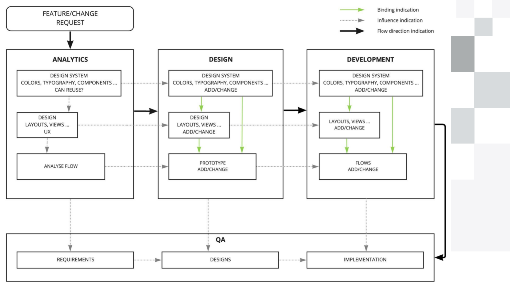
As you can see from the image above, when design systems become part of a controlled, unidirectional development flow, they make it both easier and faster to introduce new features and product changes. Think of it as a sequence of steps, one after the other:
- Analysis: This is when the team reviews and analyzes the submitted product feature (or change), and creates a specification for it.
- Design: Based on that specification, the design team creates the new design (and possibly design tokens), based on the design system’s information.
- Development: The developers make sure all changes to the design (tokens) are translated to the product’s code, and that the implementation fits the designs.
- QA: Finally, the QA team makes sure that the specification (from the Analysis stage) is correctly implemented by both the design and development teams.
And once the QA team is done and all design changes are confirmed and validated, design systems make it simple for all new UI elements to be automatically propagated and scaled to the rest of the product. Voila! Everyone’s happy.
Design systems in practice (according to us)
So much for theory – but what does all this look like IRL?
Well, we were wondering the very same thing. So we asked two of our own specialists, UX/UI designer Sigmund and front-end developer Serhii, about their most recent experiences with design systems!
Speaking about the general significance of design systems, Sigmund said:
“For me, the biggest benefits of a design system are consistency and reusability. It establishes the common grounds of communication within the design team, as well as between designers and engineers. The documentation that accompanies the design system for a product sets the tone for how the product teams will work, which is always good!”
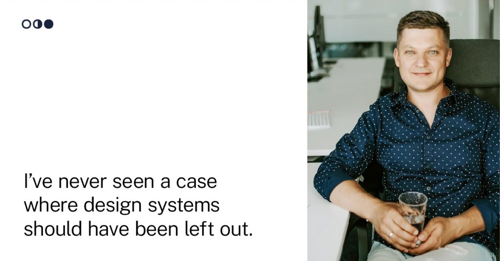
Serhii added:
“In my experience, I’ve never seen a case where design systems should have been left out. We shouldn’t think of them as something big and complex, but rather like a list of things we’ve decided to use, where we’ve defined a solution for each problem we want to solve in our project, and given it a name. But design systems can still be flexible; especially when we build them bit by bit, while following a predefined development flow.”
When we asked Serhii and Sigmund to come up with some already existing, pretty well-rounded design systems, they both recommended ones that provide consistency, reusability and scalability above all else (while still having that key amount of flexibility they mentioned before).
And we see why: design systems should be highly usable, accessible and easy to maintain, built on simple premises – even for complex products!
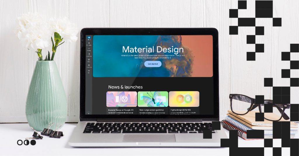
On a practical level, this means e.g. good naming conventions and a well-defined token hierarchy; our designers mentioned Google’s Material Design, Apple’s Human Interface Guidelines and Polaris by Shopify as best-practice examples, all of which are fantastic examples of both the practical workings of a design system, and the status of design systems being like a linchpin to a wide portfolio of digital products as well.
Serhii elaborated:
“Not having a design system usually creates several problems down the road, especially for companies with many products. It makes it hard to maintain consistency, and you end up with more duplications… After a while, it increases development and maintenance time and makes further development more and more expensive.”
Sigmund agreed:
“From a design perspective, the risk of not creating a design system boils down to compromising the design direction of the product itself. If there’s no design system, or even just the foundations (like typography, colors, grids, design principles, guidelines of usage etc.), the whole product will seem patched-up. Without having this ‘Single Source of Truth’, it can potentially lead to misalignment within the design team and between designers and engineers, causing a lot of back and forth discussions. The ultimate result, from a product user’s perspective: you’ll end up designing a bad experience for them.”
Tips and tricks for making your own design system
We’ve talked so much about design systems by this point that we hope you’re feeling like a professional runner before a big race: all fired up and ready to go!
To cheer you on your way, we asked Serhii and Sigmund to gather some of their most essential thoughts on actually creating a design system from scratch, so you can use it as a handy checklist:
- Audit your existing product (for both visual design and user experience) to fully understand the scope of what needs to be done.
- Define every goal and objective clearly for all stakeholders, as well as the basic components.
- Document everything you put together, right from the start.
- Make sure the naming convention is flexible enough to handle future changes or scaling.
- Always keep the token hierarchy as simple as possible.
- When adding a new token or pattern, check that it’s reusable (instead of always needing to be adapted).
- Make communication a priority, especially during the initial stages of product development (when technical limitations aren’t always taken into account).
- Involve your stakeholders in all improvements and changes to the design system.
See? Now you have all you need to start building a design system for your very own, potentially world-dominating product (like Tetris, remember?). But just in case you feel like you’d appreciate some more input, we have the solution. We have lots of experience building strong, scalable and efficient design systems to help you get on the right track. Just reach out to us to get the ball rolling. Can’t wait to see how your product will change the world!


