10 Top Website Design Tips From Mooncascade
For any web-based product to be successful, it needs to be usable. So what exactly does that mean? A website is usable when it gets three things right. It should make it easy for users to reach their goals; it should be easy to recall; and it should be easy to learn. These three website design tips lie at the heart of any great website, and good web designers always keep them in mind.
Putting those website design tips into practice can be tricky though. To do this, designers use heuristics, which are tools for helping people solve problems or acquire skills on their own. Though the term was coined by psychologists, heuristics are valuable in plenty of disciplines, including product design and software development.
Usability heuristics were developed by Jakob Nielsen in the ’90s to evaluate user experience on digital platforms. His 10 Usability Heuristics for User Interface Design are still essential reading today, offering ten practical, goal-oriented ways for teams to bring heuristics into their design process. Fortunately for us, they also translate well into a handy ‘Top 10’ list…
Mooncascade’s top ten website design tips: A foreword
Nielsen’s pointers can be applied to many digital products, but we’ll be focusing on web design as we cover them in this article. Let’s jump right in and see what they are, as Mooncascade present our list of 10 top website design tips!
1. Keep your system’s status visible.

The first of our website design tips for today involves keeping the user informed. Your website should always say what it’s doing as it works. Keeping your system’s status visible allows users to feel in control of what’s happening, take the appropriate actions to reach their goals, and ultimately, trust your product more.
Is your website loading a lot of data? That’s fine, as long as people are aware and can follow its progress. Did someone just use your contact form? Let them know their message was sent successfully. Did they mistype an address and get a 404 error? Tell them what happened and offer ways to move forward.
2. Speak the user’s language.
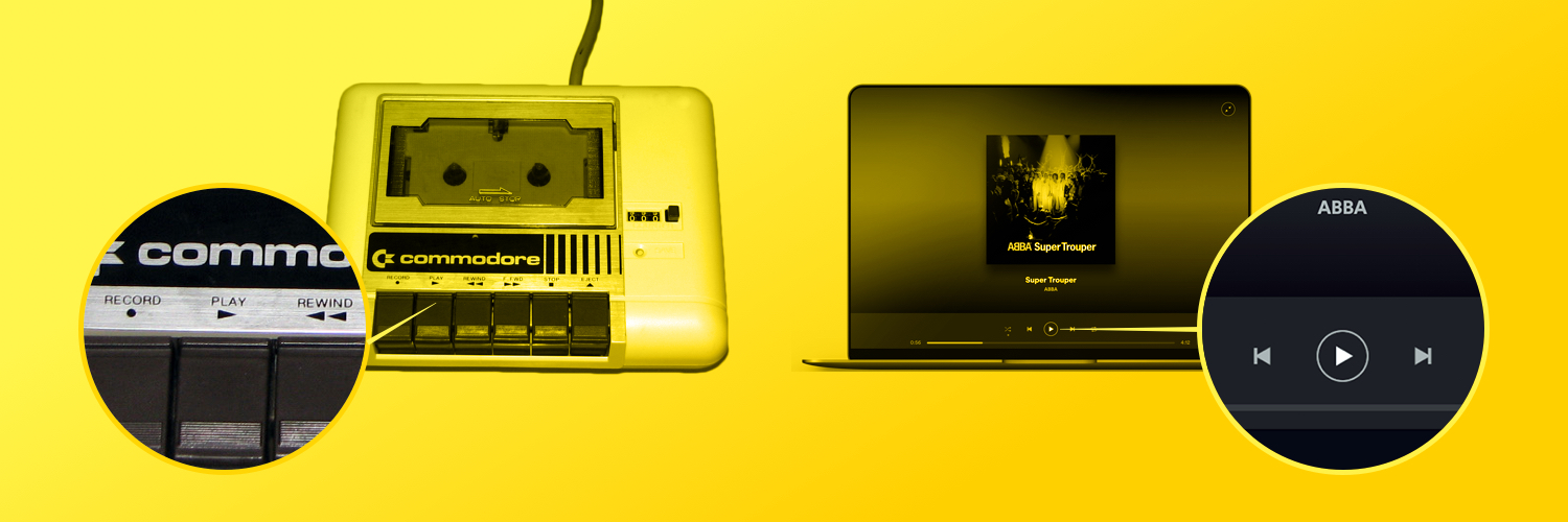
The second of our website design tips also focuses on the user, and communication. Great sites don’t use jargon, they use words, images, and concepts that are familiar to everyone. Avoid technical terms and follow conventions that make information flow in a natural, logical order. Think of websites aimed at kids, where the copy is simple, playful, and clear—yours should be just as accessible.
Recognizable symbols, like a house for the home button or the play button for starting audio and video, help minimize the gap between your product and the real world. While we are focusing on website design tips with this list, we will also mention SEO here – since using familiar terms also helps with search engine optimization, and makes your product easier to find for larger amounts of people.
3. Facilitate user control and freedom.
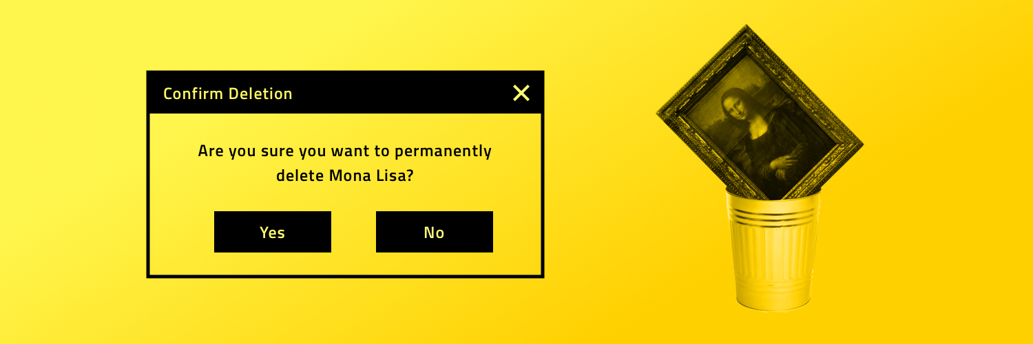
Don’t punish your users with extended dialogues when they encounter errors. The whole point of your product is to solve real-world problems, not create more of them. So the third of our website design tips for today is to be empathetic, and offer easy fixes.
This can be as simple as ensuring users can click your logo and return to the landing page no matter where they are. Or it could involve quick, clear forms of communication: ask your users if they’re sure they want to delete a post before they do, allow them to undo actions, or give them the chance to change an order once it’s been submitted.
4. Be consistent with your design.
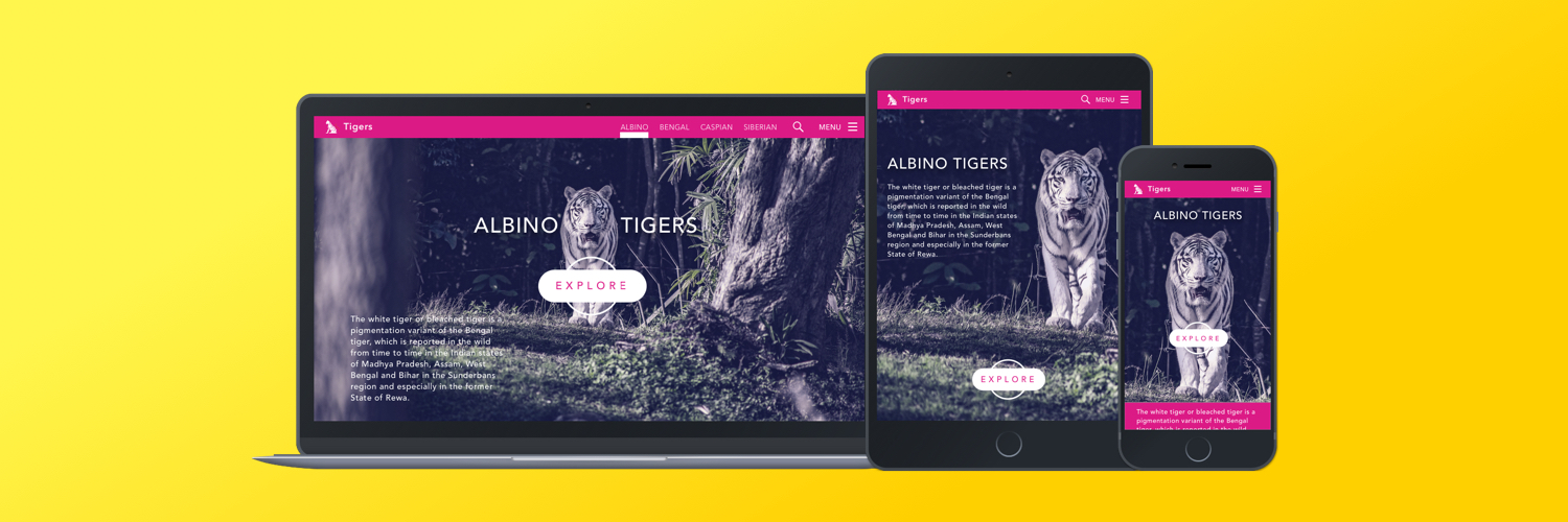
Consistent design is intuitive design. If you use the same reference points throughout your website, you’ll make it easy for users to navigate without having to think twice about what they’re doing. Consistency also makes it easy to transfer knowledge to new contexts, learn things painlessly, and save time.
The fourth in our list of ten website design tips also advises that in general, your design should be scalable and adapted to both web and mobile browsing. Make sure your typography, font colors, spacing, and layout stay the same throughout your site and across devices. Users shouldn’t have to relearn your entire product whenever they navigate to a new page or access it from a different location.
5. Prevent errors through smart design.
It’s common to see users blame themselves for errors they encounter in tech-related products. But the reality is that there’s no such thing as a “user error.” Your responsibility as a designer is to prevent problems from occurring as much as possible through careful research, planning, and testing—and there’s plenty of data out there to help.
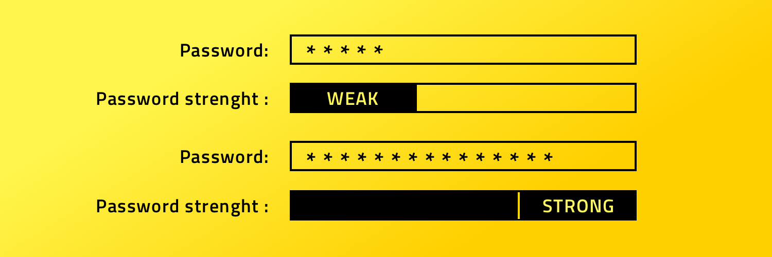
Therefore, the fifth of our website design tips is to include smart error prevention in your design. A few examples of smart error prevention in practice include: form input fields turning red when they receive an invalid entry, automatic password strength calculation, smart reminders from Outlook or Gmail telling users they’ve mentioned an attachment but haven’t included one, and typos being underlined in red.
6. Prefer recognition over recall.

We start the second half of today’s website design tips list with a pointer that touches on psychology and how the human mind works. For our brains, it’s always easier to recognize something than to try and remember it. Minimize your user’s memory load by making objects, actions, and options visible. Think of your website like a test: you’d score better on multiple-choice questions than you would if forced to come up with every answer on your own.
There are many ways of doing this in a web-based product. Some of the best examples include auto-complete suggestions in forms, “remember me” options when logging in, and showing users recently viewed items and suggestions on e-commerce sites.
7. Offer advanced users options for increased flexibility and efficiency.
We strongly recommend you put the next of our website design tips into practice if you want to make things as intuitive as possible for your user… Don’t hesitate to think critically about your user journey and find key points where you can optimize the process for your users.
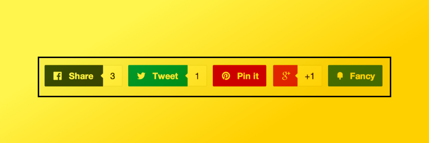
You could use widely accepted shortcuts for copy/pasting like those used in Google Docs or Photoshop, for example. You could integrate Facebook’s ubiquitous “like” function. Or you could offer customization options like those found in software installations or in a Google Image Search.
8. Strip back your design.

The eighth in today’s list of ten website design tips again deals with the workings of the human brain. You see, every unit of information in a dialogue competes with other relevant units of information for visibility. The more you have, the less visible—and less usable—your design elements will be. So say more by showing less.
Simplify your color scheme and use generous amounts of whitespace. Create a single focal point on each screen, highlighting your content and calls to action in a clear way. Don’t write long-winded copy or drown your website in stock images. Think of the Google homepage: one logo, one search bar, and two buttons. It does the job perfectly.
9. Help users recognize, diagnose, and recover from errors.
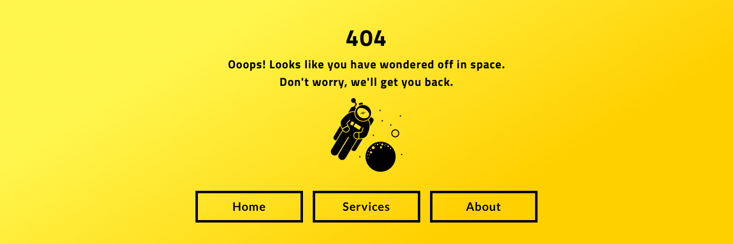
Though you should always aim to prevent errors, it’s inevitable that some will eventually sneak past a user. However, the next of our website design tips can help you minimize their impact. Error messages should be expressed in plain language, without codes, precisely indicating the problem and offering a constructive solution. The web’s most common error, the 404, obviously violates most of these guidelines. Try a custom version, like ours.
10. Maintain clear documentation.
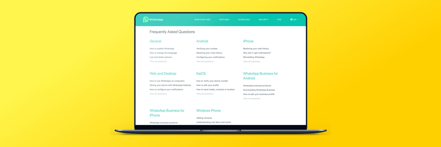
We’ll close out our website design tips list by talking about user help documentation. Of course we know that no one ever reads help documentation, but someday, someone might. So, you need to make sure yours is easy to search through, focused on user tasks and offering clear steps to follow. Try not to make it too long. Some possible things to include are: help pages, an FAQ, an online chat, and a list of explanations for any possible issues a user might encounter.
Usability heuristics, the secret to a great product
In an ideal world, users would be able to understand any product intuitively and without explanation. Unfortunately, that’s completely impossible. So you have to think about your user’s learning process as you build something, and make the learning curve as short and simple as possible for them. The list of website design tips presented above is sure to help you do just that.
The more you design with usability in mind, the more people will come back to your product and the more it’ll gain traction among your target segment. Heuristics won’t just improve UX and generate value for your users—they’ll generate value for your entire business, too.
WANT TO IMPROVE THE USABILITY OF YOUR PRODUCT?
Good. We have a team of design and software development experts that can help you to do this. Sometimes that will mean implementing the website design tips we’ve listed above, while at other times your unique problems might need a more bespoke solution – but rest assured that we can help! Why not get in touch today and let us have a look at what you have in mind?


