Accessible Design: How It Works and Why It Matters
We tend to think of accessibility in black and white terms. In reality, it’s more of a grayscale. Have you ever tried making a phone call with your hands full? What about reading something on a digital device outside on a sunny day, or shopping online with a broken trackpad?
Accessibility concerns us all. Any user can be affected by the challenges of everyday life, whether they’re permanent disabilities or temporary frustrations. Tackling accessibility head-on won’t just make a product more inclusive, it’ll widen its scope, improve its performance, and increase its value, too.
This approach, called accessible design, is quickly gaining traction in the world of product development. Let’s have a look at what it means, what you can do to get started, and what its costs and benefits are.
What is accessible design and why use it?
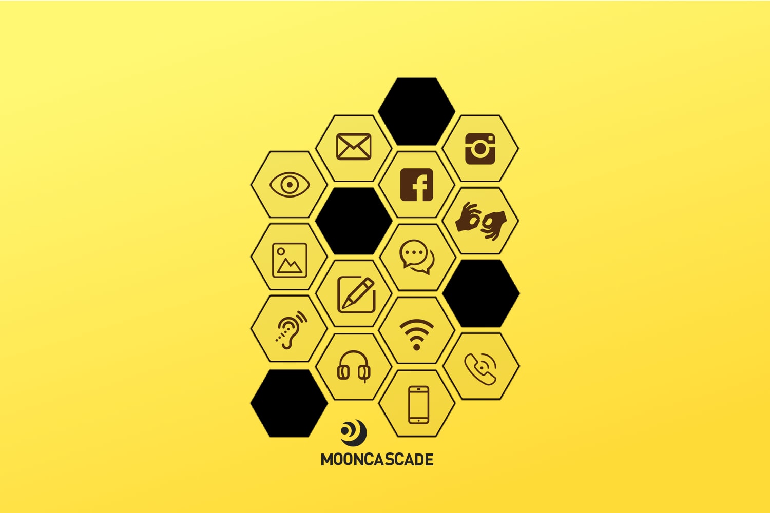
The goal of accessible design is to build something that’s easy to use for anyone, in any context. Depending on your product, you may have to think about barriers ranging from visual impairment, auditory difficulties, trouble with motor skills, or learning disabilities.
Accessible design should also consider temporary impairment (say, an injury), situational impairment (driving a car, for example), and impairment by proxy (like having to care for ill, elderly, or disabled friends and family). The idea is to build a user experience that can stand up to any real-world challenges it might face.
Companies often show a lack of empathy or interest in accessibility. But a good business case can be made for it. Accessible design will extend your market reach to the 1 billion people living with disabilities worldwide. Plus, it’ll improve your product’s usability, create happier customers, and enhance your brand image.
Think of accessible design as a tool for having your product satisfy the needs of as many users as possible. It’s not just the right thing to do for the world. It’s the smart thing to do for your business.
Small steps towards accessibility, big steps for UX
Does that sound convincing? Here are a few steps you can take to get started with accessible design:
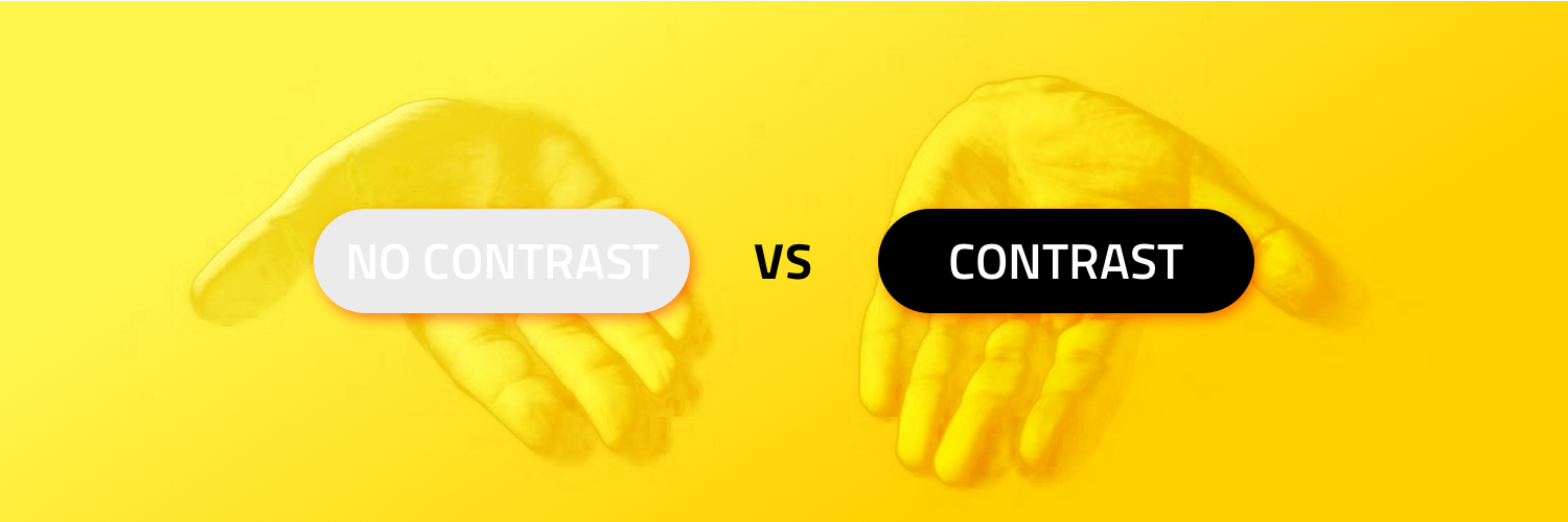
Color contrast. One of the more common accessible design principles – one that many people apply without even realising that it is accessible design – is to think about the contrast between your font, background color, icons, and images. This doesn’t just help the visually impaired, it’s also essential for anyone trying to read long-form pieces on a screen or in bright light.
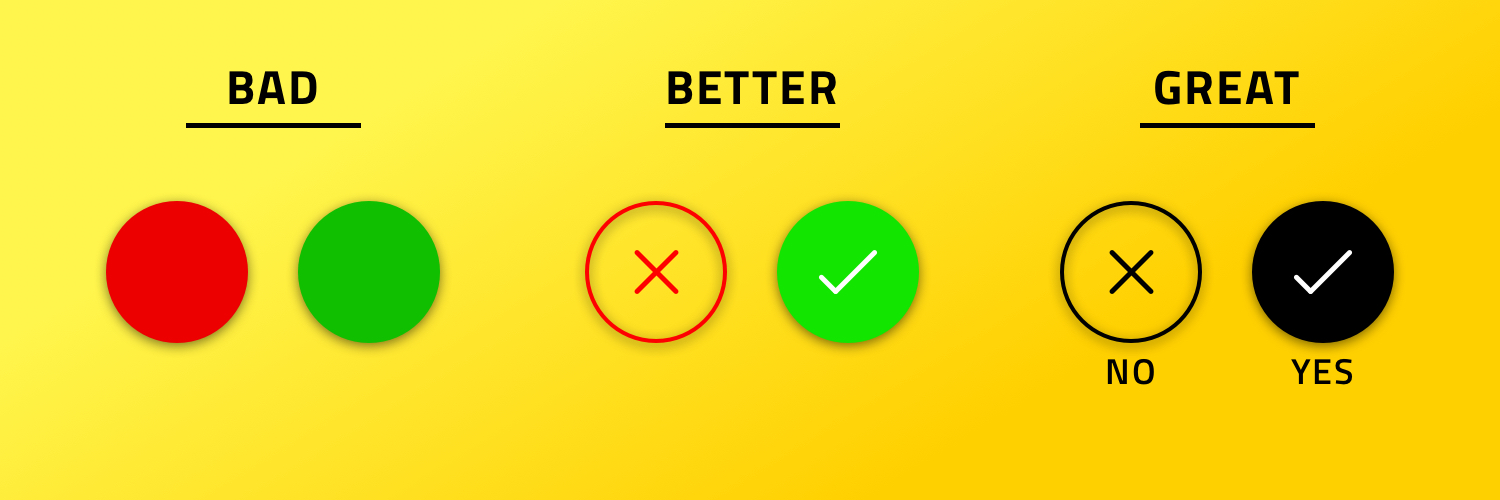
Differentiated fonts. Websites will often use the colors red and green to determine the success or failure of a given action. But this can make things difficult for users who are color blind. Consider alternate ways of distinguishing cases, like changing font shapes or sizes.
Design scalability. Do you know how to identify a cheap website? If the font size and responsiveness break down when you zoom in or out, you’ve found one. So think about responsive design. This is helpful for elderly and visually-impaired users, but it also ensures your website looks good on any screen it’s read on.
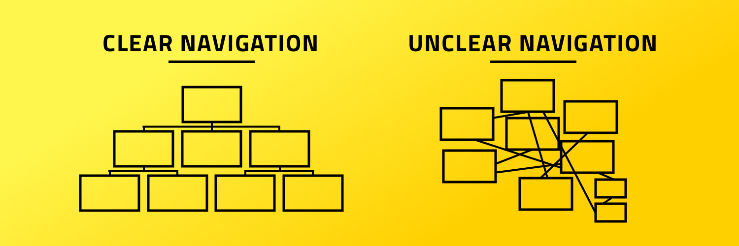
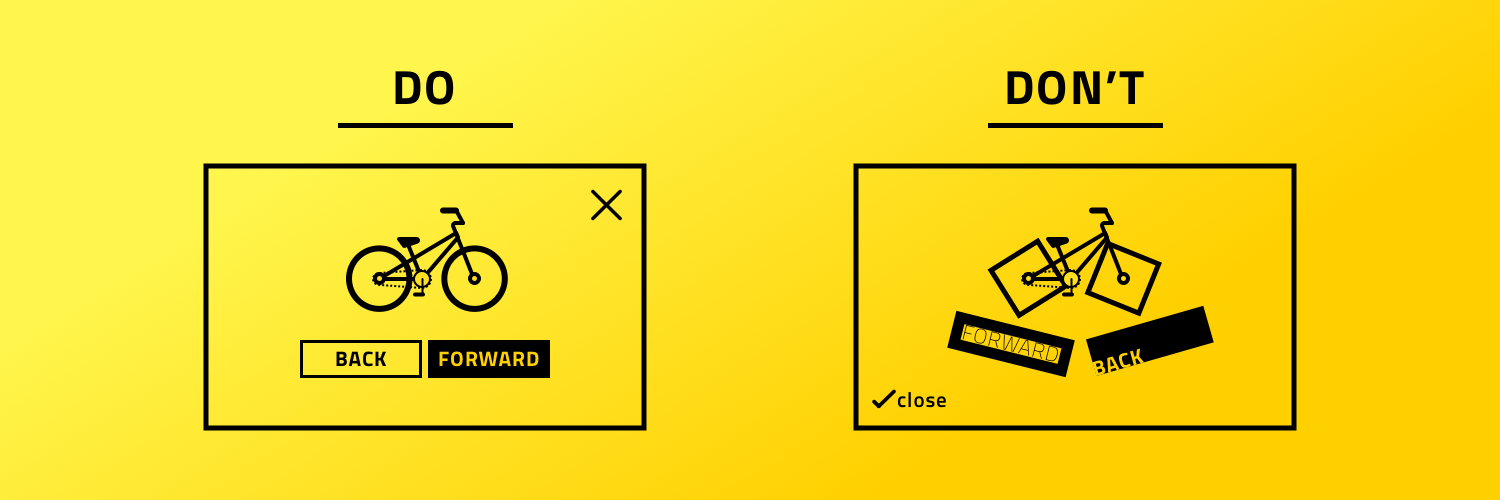
Clear navigation and screen structure. Your website’s flow should be logical, intuitive, and easy to use. That’s UX 101. One great way to pressure test this is to see how it handles keyboard navigation or VoiceOver use. If the structure behind your pretty design is a mess, these accessible navigation methods will show it.
Familiarity. Remember: you don’t have to reinvent the wheel every time you’re building a new website. In fact, it’s probably not a good idea to try and revolutionize how users close a window or click links in their web browser. Best practices are best practices for a reason. Sticking to these will help keep things clear and comfortable for users across the ability spectrum.
Following these general principles is a great start. But it’s just as important to understand what your particular product needs to be more accessible to its users.
Know your product, make it accessible.
One way to determine the specific issues that will be relevant to your business case is to pinpoint the value you’ll be providing. Does your product provide a basic service, like groceries or transportation? Does it fit into a niche, like entertainment, adventure, or board games? Is it a health product, like fitness-tracking or an online pharmacy?
Next, draw up accessibility personas to better understand your users and determine what kind of impairment they’ll be facing. For example, Mooncascade is currently working with a bus ticket aggregator that operates across all of Estonia. This means we have to find a solution that’s accessible to every single person in the country, with every potential level of disability that might include.
But if you’re working with something like a coffee shop, the range of accessibility issues you face will be smaller. You’ll have to worry about temporary issues like sunshine making it hard to read on laptops, or enabling people to drink a cappuccino while driving. The idea is to identify the most demanding potential impairment in a given context and go from there.
Costs and benefits of accessible design
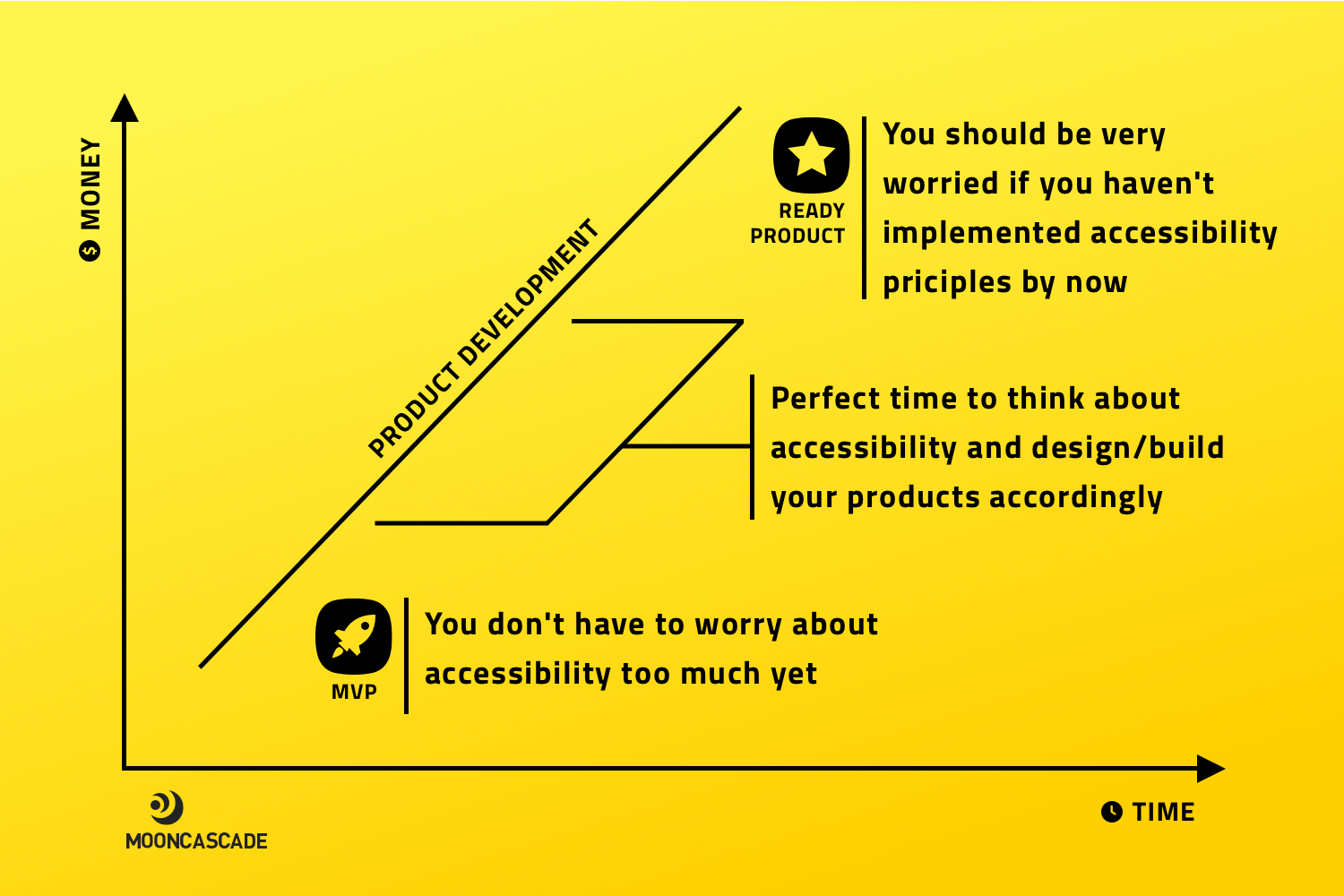
Smart accessible design is also about timing. You don’t need to worry about accessibility too much when building prototypes or proof of concept solutions. But the later you wait, the more costly and difficult it’ll be to integrate.
It’s best to start testing accessibility and accessible design solutions in the prototyping phase. Basic things like font contrast or design scalability will only slightly extend the project length and won’t require a separate prototype to test. Plus, there are plenty of great resources to help you get started.
More complex features like VoiceOver and keyboard navigation might call for a UX specialist, however. This will take longer, though it’s important to note that much of this extra time will be taken up by learning curves. The more your team tests features like these, the faster they’ll be able to integrate them in the future.
Focusing on accessible design early on will also help optimize your UX overall, because it’ll force you to spend more time thinking about improving your user journey. Better UX means more user conversions, increased user loyalty, and of course, better returns for your business.
Accessibility: a small investment with big returns
Accessible design might seem daunting if you’ve never considered it before. But just like any other process focused on improving user experience, it gets easier as it becomes a regular part of your arsenal.
My advice is to get your whole team involved: product owners and analysts deciding how deep you’ll go, designers focusing on visual accessibility, service designers focusing on the whole user experience, developers handling navigation and VoiceOver implementation, and QA specialists taking care of testing.
Before you know it, everyone will have accessibility on their checklist. You’ll be making the world a better place, all while increasing your product’s reach, streamlining its performance, and building its value. Who knew that a grayscale could add so much color to things?
Accessibility got your interest?
We can help you to expand your market and increase your user satisfaction by designing and developing accessible and inclusive solutions that fit the needs of all your users. Let’s have a call and see what we can do for you.


