10 Frightening UX Monsters All Designers Fear – and How To Overcome Them
Everyone’s afraid of something—even designers. That being the case, I spoke with different app, web, and service designers about things that give them the creeps and asked them what they do to overcome their fears.
So here it is: 10 UX Monsters, and how to beat them.
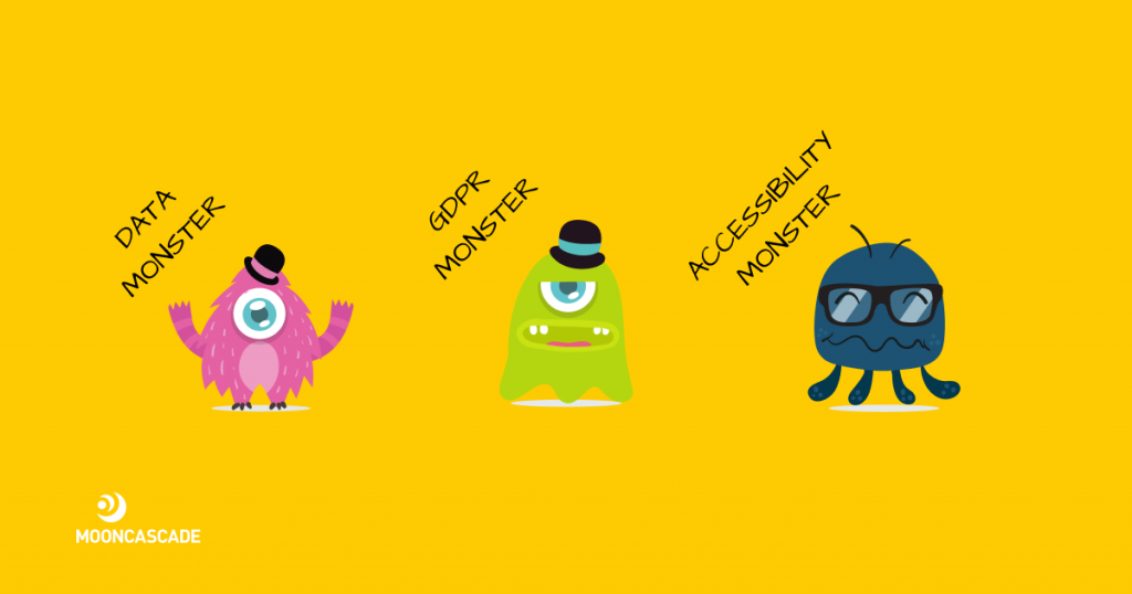
The Data Monster
The Data Monster is the first of our UX monsters, and it is scary because it overwhelms designers with, you know, data. Loads of it: analytics, graphs, Excel spreadsheets, documents, you name it. Even if you’re good with numbers, the Data Monster will find a way to make you feel totally incompetent.
How to defeat this monster:
Beat the Data Monster by asking the data’s owner to explain what the data needs to do. Alternatively: team up with someone good with numbers and go through the data together. Also an option: use
Heap or a similar tool to visualize and better understand the data.
The GDPR Monster
The second of our UX monsters, the GDPR Monster is the Data Monster’s cousin. Instead of overwhelming you with data, the GDPR Monster constantly threatens you with fines that can reach up to 10 million euros if you break the law.
How to defeat this monster:
The basics: How will GDPR affect UX design?, UX Design and GDPR: Everything You Need to Know. A revelation: occasionally, the GDPR Monster might be acting out of its jurisdiction. If it won’t leave you alone even if you’ve done everything correctly, it’s time to turn things over to the project manager.

The Accessibility Monster
Like the GDPR Monster, the Accessibility Monster is scary because it has the weight of the law behind it. Unlike other UX Monsters, however, the Accessibility Monster is actually made up of a set of triplets: WCAG 2.0, WCAG 2.1, and WCAG 2.2. To make things worse, each of the accessibility UX monsters looks almost identical and loves punishing anyone who makes the mistake of mixing them up.
How to defeat these three UX monsters:
The basics: What is accessibility and why it matters, Color Contrast Checker, Web Accessibility Evaluation Tool.
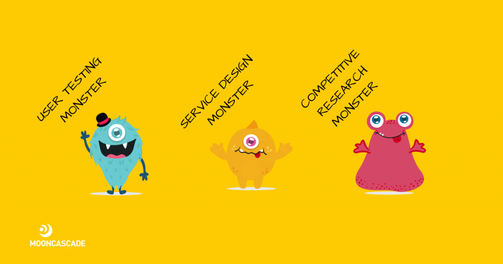
The User Testing Monster
Next on our list of UX monsters, the User Testing Monster. People who have faced up to the User Testing Monster before know that it can present a wide range of diverse problems that all seem to be at odds with each other – causing confusion and making it harder to make the right choice as to a solution.
How to defeat this monster:
The basics: How to do remote user testing during COVID-19. Active listening: instead of tuning the noise out, focus on what your user-testers are actually saying. If you can figure out the problems they’re having and why, you’re more likely to be able to find solutions that deal with their problems, and make your app better.
The Service Design Monster
At number 5 on our list of UX monsters, we have the Service Design Monster. This UX monster is problematic because it challenges designers’ belief in their brief, and their tolerance of things that don’t look ‘as they should’. The Service Design Monster leads developers on wild goose chases and up blind alleys in the belief that they are creating something ‘as it should be’, when in reality it’s just not what the client or the app’s user base wants, or will use.
How to defeat this monster:
The basics: What is service design and why use it in your product development? The differences between service design and app/web design aren’t that big. Both focus on user experience, but service design does it while taking into account a person’s interaction with the service more thoroughly, and can also be applied to designing offline services.

The Competitive Research Monster
The sixth of today’s UX monsters can really make you compare yourself with others and destroy your confidence. It makes you focus on (and believe in) the notion that there’s nothing more important than being better than your competitor – not even practicing good design, or meeting the needs and wants of your user base.
How to defeat this monster:
The basics: Value and benefit-based feature prioritization canvas. Combine competitive research with user research. This really helps balance gaining insight about your market and keeping your focus where it matters: on your users and their specific needs.
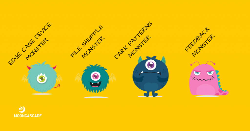
The Edge Case Device Monster
Number seven on our list of UX monsters, the Edge Case Device Monster comes in all shapes and sizes and can really drive you crazy. Having you work on assignments only for the smallest and largest screens possible, the Edge Case Device Monster makes sure no screen scales or scrolls the same. No wonder its victims are always on edge.
How to defeat this monster:
The basics: Lay out scaling rules and breaking points. Communicate with developers, make sure they’re on the same page as you are, and make sample screens for them. Run development reviews on edge case simulators or actual devices.
The File Shuffle Monster
Now our list of UX monsters turns to The File Shuffle Monster – which can strike seemingly without warning. All it takes is for a person to drop their guard for a moment, to turn their eyes away from the screen for just a second, and the File Shuffle Monster can be there – changing everything for the worse.
How to defeat this monster:
The basics: How to Create a Well-Organized File Management System for Designers. Mind your karma here! If you don’t want to run into the File Shuffle Monster yourself, make sure you don’t make this most annoying of UX monsters appear to anyone else either…

The Dark Patterns Monster
The penultimate entry in our list of UX monsters, the Dark Patterns Monster is highly deceptive. It can certainly make you second-guess yourself, and convince developers that – against all logic, professional instinct, and what they know is right or wrong – their users do indeed want something that is (on paper), ridiculous – such as a 200-click logout journey.
How to defeat this monster:
The basics: Usability heuristics.
The Feedback Monster
Last (but definitely not least) in our catalogue of UX monsters, the Feedback Monster is a frequent companion of UX Designers. Like the User Testing Monster, the Feedback Monster affects its victim’s hearing: a person who has come up against this monster starts to hear only bad or only very good things about their work.
How to defeat this monster:
The basics: soundproof headphones. On a more serious note: How To Train Yourself To Take Feedback Well.
Let’s beat the UX Monsters together
Overcoming the UX monsters can be hard, especially when you go at it alone. Though there are definitely still things we’re afraid of as people, as designers we beat our UX Monsters and we’d love to help you beat yours—if you let us.

